Effective Medical Data Visualization Techniques


In today's data-driven healthcare environment, the ability to effectively visualize complex medical information has become an essential skill for clinicians, researchers, and healthcare administrators. Well-designed visualizations can reveal patterns, communicate findings, and support clinical decision-making in ways that raw data simply cannot.
Principles of Effective Medical Visualization
Before diving into specific techniques, it's important to understand some foundational principles:
1. Know Your Audience
A visualization for patient education will look very different from one designed for specialist clinicians or hospital administrators. Consider the viewer's technical background, information needs, and decision-making context.
2. Maintain Clinical Accuracy
While aesthetic considerations are important, medical visualizations must never sacrifice accuracy for style. Ensure all scales, proportions, and representations precisely reflect the underlying data.
3. Prioritize Clarity
Remove unnecessary chart elements (sometimes called "chart junk") that don't contribute to understanding. Use color, size, and position strategically to highlight what's most important.
Common Medical Visualization Types
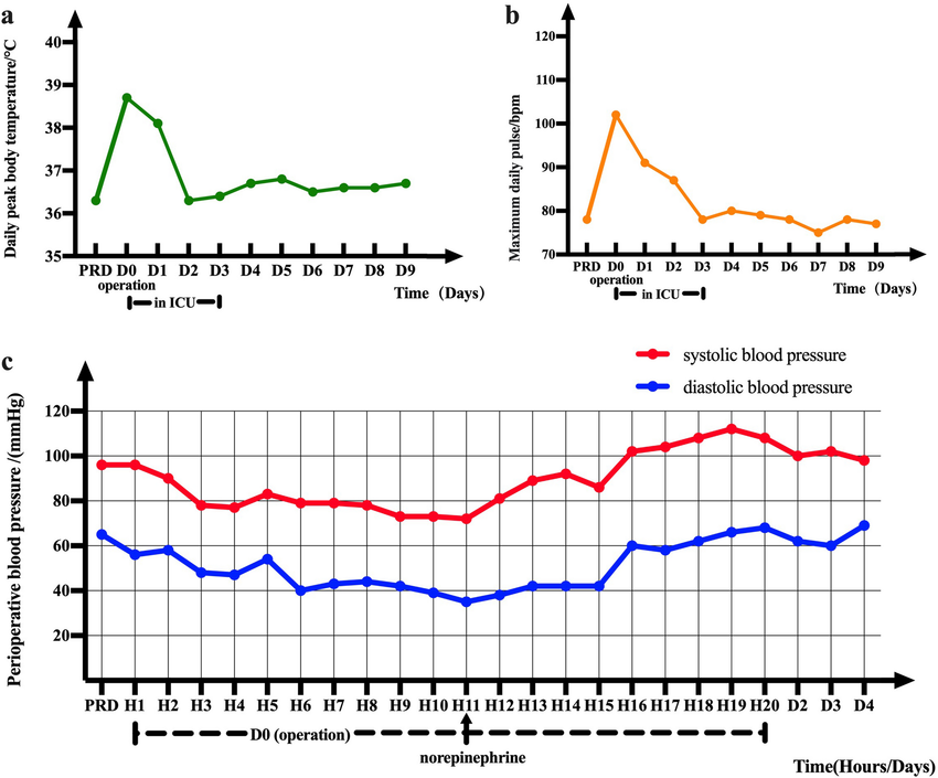
1. Temporal Data: Patient Vital Signs
Line charts remain the gold standard for showing changes in vital signs over time. Best practices include:
- Using consistent time intervals on the x-axis
- Highlighting clinically significant thresholds (e.g., fever line at 38°C)
- Grouping related measurements (e.g., blood pressure components)
2. Comparative Data: Treatment Outcomes
When comparing outcomes between treatment groups or patient cohorts:
- Bar charts work well for simple comparisons
- Box plots show distribution characteristics (median, quartiles, outliers)
- Forest plots are ideal for meta-analyses of multiple studies
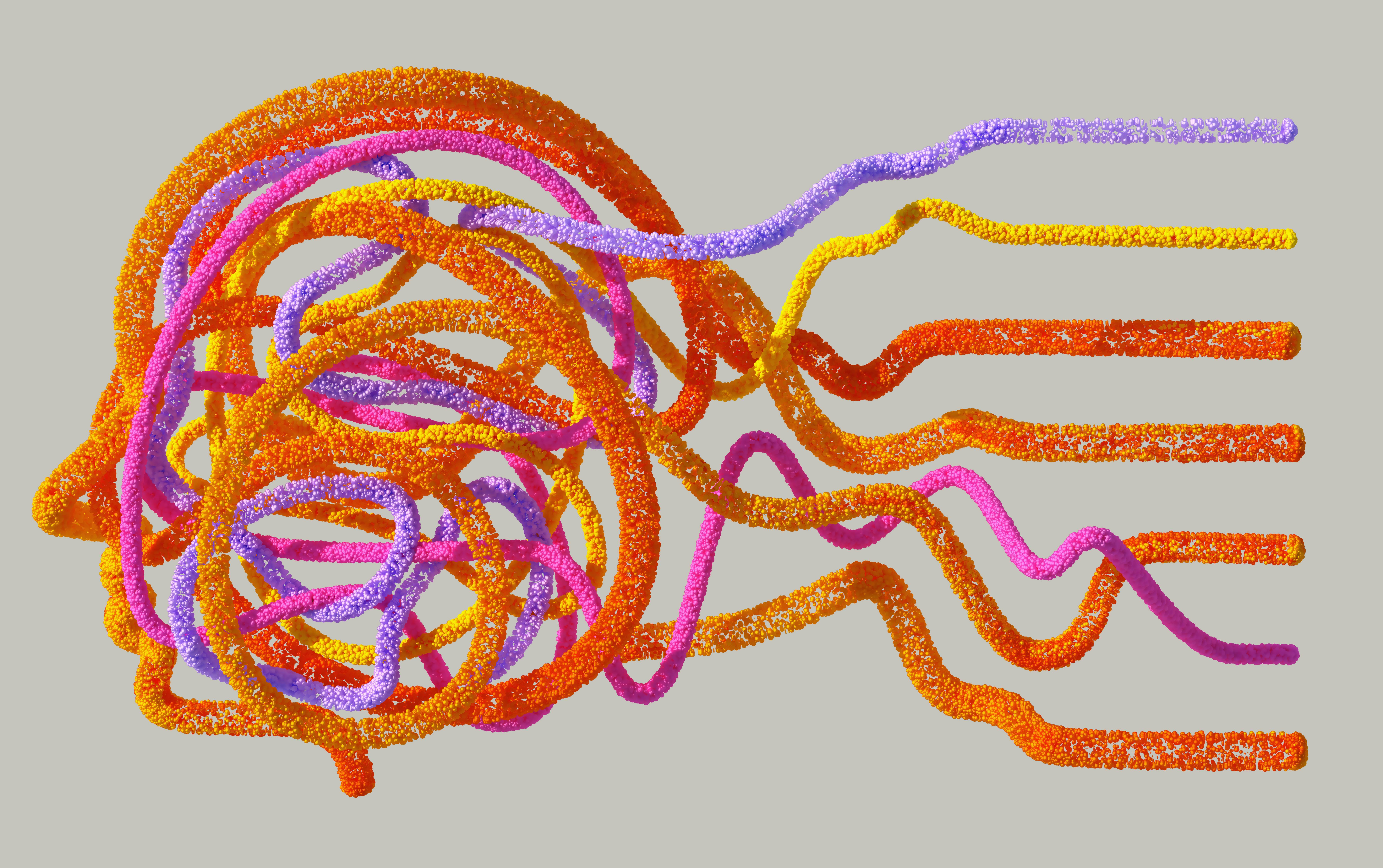
3. Anatomical Data: Imaging and Procedures
For anatomical representations:
- Use standardized anatomical views and terminology
- Consider interactive 3D models for complex structures
- Highlight pathological findings with appropriate contrast
Advanced Techniques
Emerging visualization approaches are pushing the boundaries of medical data interpretation:
Interactive Dashboards
Web-based dashboards allow clinicians to:
- Filter data by relevant parameters
- Drill down into specific patient subgroups
- Compare multiple views simultaneously
Augmented Reality Visualization
AR technologies enable:
- Projection of imaging data onto patient anatomy during procedures
- 3D navigation through complex anatomical relationships
- Real-time data overlay in clinical environments
"A well-designed medical visualization doesn't just present data—it tells a clinical story that leads to better patient outcomes."
Tools and Resources
Here are some tools I've found particularly useful for medical data visualization:
For Clinical Teams
- Tableau: Powerful dashboard creation with healthcare templates
- Plotly: Interactive web-based visualizations
- D3.js: Custom visualization development
For Patient Education
- BioDigital: 3D anatomical models
- Canva Medical: Pre-designed templates for patient materials
- Flourish: Easy-to-use animated visualizations
As healthcare continues to generate ever-larger amounts of complex data, the ability to transform that data into clear, actionable visual insights will only grow in importance. By mastering these techniques, medical professionals can enhance their practice and improve patient communication.
Related Articles